Clarity
Clear Town communications and clearer wayfinding
MEDIA RELEASE
Prescott, ON – On behalf of Ontario’s Minister of Education, Paul Calandra,
MPP Steve Clark announced that the Province of Ontario is investing $28.1
million to construct a new public elementary school in the Township of
Augusta. The new school will replace and consolidate Maynard Public School
and Wellington Public School into a modern facility designed to serve
students and families throughout the South Grenville region.
The new school will be located near the Alaine Chartrand Community Centre
in Prescott on land currently owned by the Township of Augusta. Once
complete, the facility will offer 435 student spaces and 127 licensed childcare
spaces, supporting current and future growth in the community.
“This investment by the Ministry of Education and the Upper Canada District
School Board is a foundation of support in growth for both the Township of
Augusta and the Town of Prescott’s communities,” said Mayor Jeff Shaver.
“With the replacement of two 1950’s schools, brings us a new modern
learning environment plus urgently needed childcare spaces that will be
greatly accepted by the residents of both communities. This was made
possible by the cooperation of both municipal councils, a forward-looking
district school board, and with diligent assistance by our MPP Steve Clark.”
“Yesterday’s announcement demonstrates what partners can achieve when
they work together,” said Mayor Gauri Shankar. “We thank the Upper Canada
District School Board, MPP Clark, and the Province of Ontario for investing in
the South Grenville area to provide a modern environment for students to
start their lifelong journey. The Town of Prescott is proud to partner with the
Township of Augusta to bring positive change to the residents of our two
municipalities. We look forward to seeing this project come to fruition and
welcoming our communities to a school we will all be proud of.”
The announcement marks a significant investment in educational and childcare
infrastructure for the region. The new facility will provide a modern learning
environment for students while supporting the needs of families and
strengthening the long-term vitality of both communities. The project reflects the
successful collaboration between municipal partners, the Upper Canada District
School Board, and the Province of Ontario in delivering important community
infrastructure that will benefit residents for generations to come.
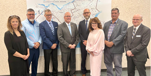
Shannon Brown, Manager of the United Counties of Leeds and Grenville Children’s Services, Gauri Shankar, Mayor of the Town of Prescott, Jamie Schoular, Chair of the UCDSB, MPP Steve Clark, Ron Ferguson, CEO of the UCDSB, Jennifer Perry, Superintendent of Schools at the UCDSB, Jeff Shaver, Mayor of Augusta Township, Michel LaBonte, Ward 5 Trustee at the UCDSB.
For more information, please contact:
Shannon Geraghty, Chief Administrative Officer
Township of Augusta
sgeraghty@augusta.ca
613-925-4231 ext. 102
Matthew Armstrong, Chief Administrative Officer
Town of Prescott
marmstrong@prescott.ca
613-925-2812 ext. 6220
For media inquiries, please contact:
Willow Anderson, Economic Development and Communications Coordinator
wanderson@augusta.ca
613-925-4231 ext. 304

You’ll start noticing a new look across Prescott communications—on signs, social media, printed materials, and at Town facilities. This update brings consistency to how we show up as a community, and helps people quickly recognize what’s official, what’s tourism-focused, and what’s business-focused.
It’s not change for the sake of change. It’s a practical refresh that reflects how Prescott is being experienced today: a historic riverside town with a lively downtown, an active waterfront, and a growing calendar of things to do.

As Prescott grows, our communications need to work harder. A strong brand helps people find us, understand us, and choose us—whether they’re planning a day trip, deciding where to open a business, or looking for community programs and services.
Clear Town communications and clearer wayfinding
A professional look that matches the quality of what’s happening here.
Storytelling that highlights the parts of Prescott people remember—our waterfront, our downtown, and our community spirit.
The updated brand is built around a simple promise: "You're in for a surprise." People come for the river, the history, or a quick stop—and end up staying longer than planned. They discover a patio, an event, a shop they didn’t expect, a view that makes them slow down, or a sense of place that leaves them never wanting to leave.
This brand helps us tell that story consistently, while keeping the tone grounded and authentic—because the best parts of Prescott aren’t manufactured. They’re already here.

Prescott is one community—but people interact with the Town in different ways. Sometimes you’re looking for municipal information or services. Sometimes you’re planning a visit. Sometimes you’re running a business or considering an investment. The updated brand creates a single, consistent look and feel that signals “this is Prescott,” while making it easier to tell what kind of information you’re looking at.
Going forward, you’ll see the same core identity and design system used across municipal communications, tourism, economic development, and community services—so materials feel connected and recognizable. Within that system, each area has its own clear purpose:

Communications focus on official municipal information, programs, regulations, services, and public notices.

Focuses on visitor experiences—things to do, seasonal highlights, events, and local storytelling.

Focuses on business news, resources, and economic development initiatives that support local growth and investment.

Communications focus on recreation, facilities, programming, and opportunities to get involved.

Focused on Downtown events, business supports & activities,
This brand refresh was built through a structured discovery process designed to reflect Prescott as it is today—and where it’s headed next. Alphabet Creative reviewed existing research and Town plans, looked at Prescott’s current marketing and communications materials, and grounded the work in local input from stakeholders and the broader community. You can learn more about Alphabet's process on their page, "The Town of Prescott redefined."
The research and consultation surfaced four clear themes that now underpin the brand direction: the need for brand consistency, a desire to move beyond an identity anchored only in “Fort Town,” the reality that Prescott is in transition, and the importance of waterfront connectivity as a defining asset and future opportunity.
The brand is organized around a set of themes that reflect what people experience here—from the waterfront to community life to downtown energy. You’ll see these ideas show up in campaigns, content, and how we tell Prescott’s story across seasons.
The goal isn’t to force everything into a slogan—it’s to make sure our communications consistently reflect the full Prescott experience.

Have questions or comments about the new brand?
Reach out to the Town of Prescott—your feedback helps us keep improving how we communicate.